Angular's Deferrable Views
If you’re following Angular development, there has been a rapid evolution in features and API. Angular 17 introduced template control flow that provides the mechanism to dynamically control how and when components and elements are rendered on the page.
Basic Angular’s template control flows are directives like @if and @for, which enable conditional rendering and looping through Arrays etc. These controls replaces the *ngIf and *ngFor. While these control flows are quite handy, Angular introduces an advanced concept known as deferrable views as part of these control flows that can further optimize performance and control over rendering.
Deferrable views allow developers to delay the rendering of a component or element until it is absolutely necessary. This means that certain parts of the application are not processed or added to the DOM until a specific condition or event. This is particularly useful in scenarios where rendering certain components immediately could be expensive in terms of performance or where the component is not immediately needed by the user. By deferring views, you can significantly reduce the initial load time of your application, improve performance, and manage resources more effectively.
To understand the how the deferrable work, we’ll use some examples as we go. Consider a simple AppComponent in which you want to render another component, MyComponent when user clicks a button
@Component({
selector: "app-root",
standalone: true,
imports: [MyComponent],
template: `
<div class="container">
@if (showComponent) {
<MyComponent />
}
<button (click)="showComponent = true">Show Component</button>
</div>
`,
})
export class AppComponent {
showComponent = false;
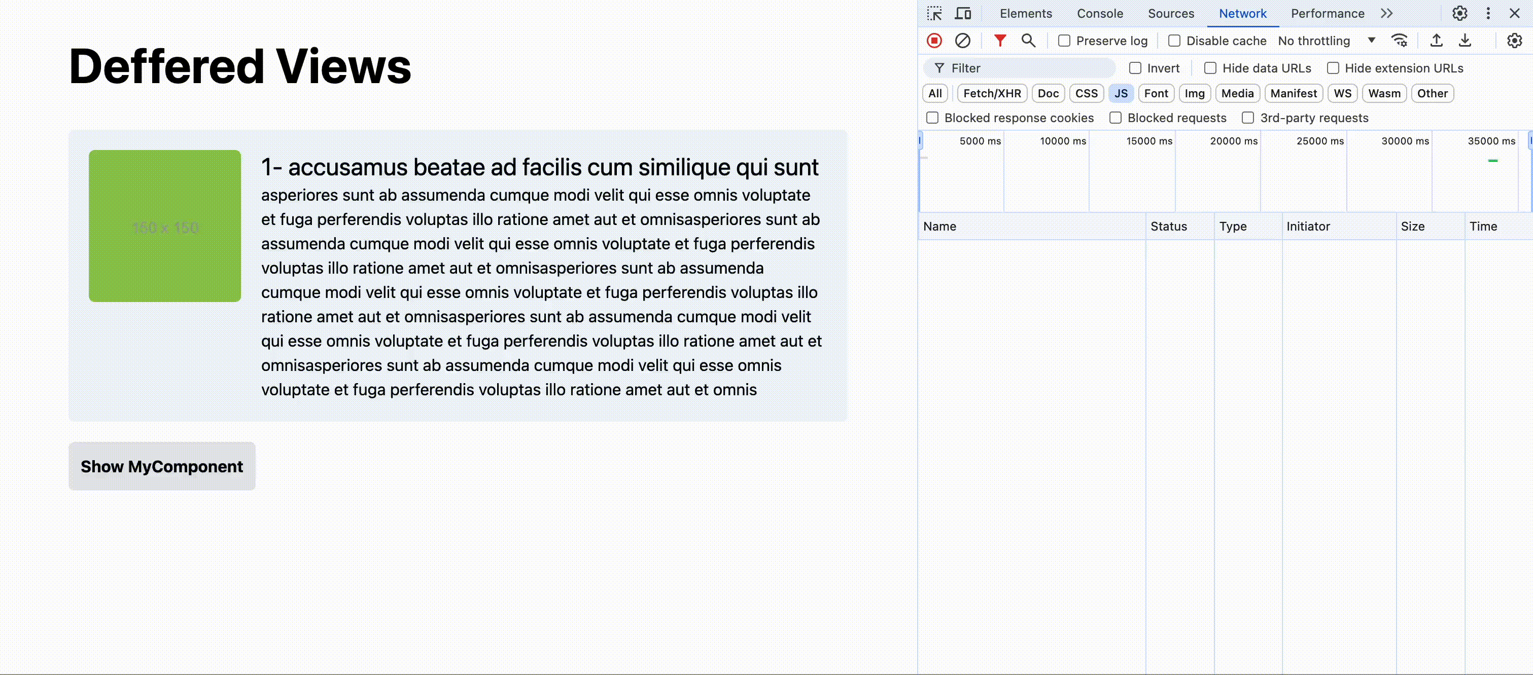
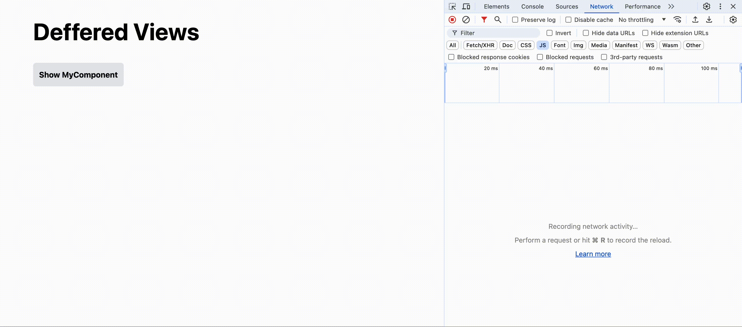
}With above code, MyComponent is rendered in DOM when the button is clicked. However, if you take a look at the network panel, you’ll notice that code for MyComponent was already downloaded. So with this approach, we download the code that we may or may not need.
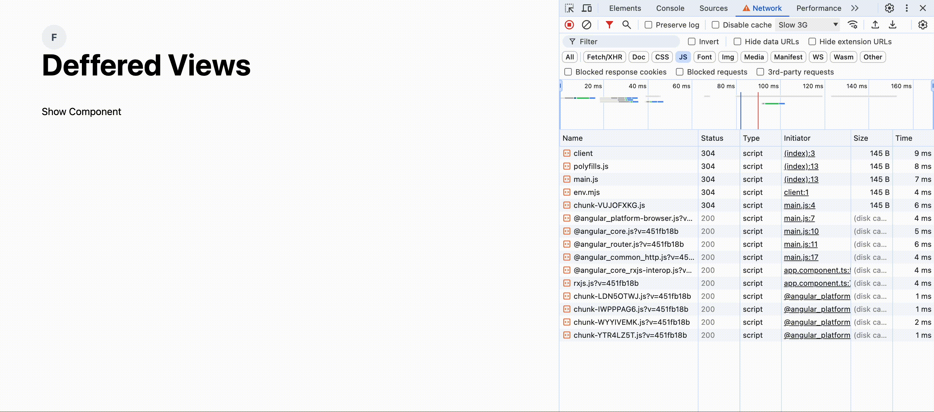
Let’s replace the @if block with @defer
@Component({
  selector: "app-root",
  standalone: true,
  imports: [MyComponent],
  template: `
    <div class="container">
      @defer (when showComponent) {
        <MyComponent />
      }
      <button (click)="showComponent = true">Show Component</button>
    </div>
  `,
})
export class AppComponent {
  showComponent = false;
}
We will dive deeper into @defer API in next sections but what we’re doing in above code is that we’re deferring the download and rendering of MyComponent until showComponent is set to true as you can see it in the following
Let’s take a look at the other building blocks of deferrable that can be combined to achieve great user experience.
@placeholder- This block can we be used to show a placehoder/alternate content before the component/content is loaded.@loading- As the name implies, this is content block that is displayed when the content is in the loading state.@error- If the component fails to load, this is the block that is displayed.
@Component({
  selector: "app-root",
  standalone: true,
  imports: [MyComponent],
  template: `
    <div class="container">
      @defer (when showComponent) {
        <MyComponent />
      } @placeholder {
        <button (click)="showComponent = true">Show Component</button>
      } @loading {
        <p>Loading MyComponent</p>
      } @error {
        <p>MyComponent Failed to load</p>
      }
    </div>
  `,
})
export class AppComponent {
  showComponent = false;
}
So far, we have only use when operator in our examples. As powerful as when operator is, there are several out of the box solution that Angular offers that we can use to capture user interactions and browser behaviors etc.
On Condition
The on condition is far more powerful than simpler when condition that accepts a boolean. Let’s take a some of the options with examples,
On Immediate
This is the most basic variation of on condition. It makes MyComponent lazy loaded but make sure it’s rendered immediately after it’s downloaded.
@Component({
  selector: "app-root",
  standalone: true,
  imports: [MyComponent],
  template: `
    <div class="container">
      @defer (on immediate) {
        <MyComponent />
      }
    </div>
  `,
})
export class AppComponent {}
On Idle
Quite a powerful variation of on condition IMHO. It uses the requestIdleCallback API to load and render MyComponent.
@Component({
  selector: "app-root",
  standalone: true,
  imports: [MyComponent],
  template: `
    <div class="container">
      @defer (on idle) {
        <MyComponent />
      }
    </div>
  `,
})
export class AppComponent {}
On Viewport
Remember the virtual scroll from Angular CDK? on viewport is a simpler and better version of it. This condition allows defers the rendering of MyComponent until it enters the viewport. This can be really handy and powerful if you’re dealing with large dataset in conjunction with @for loop. Consider following example,
@Component({
  selector: 'app-root',
  standalone: true,
  imports: [MyComponent],
  template: `
    @for ( item of items; track item.id) {
      @defer (on viewport) {
        <MyComponent [item]="item" />
        <img src=`https://picsum.photos/id/${item.id}` />
      }
      @placeholder {
        <p>I am a placeholder. When I enter viewport, I'll trigger the rendering of deferred block!</p>
      }
    }
  `,
})
export class AppComponent {
  // Creates array with 50000 items in it
  items = [...new Array(50000)].map((_, index) => ({ id: index, name: index + 1 }));
}
In the above example, we have an array for 50000 items and for each of them, we’re rending MyComponent and an img element. If we render all of them when page loads, it will most likely hang the browser tab. But with @defer block, we only render elements when the placeholder enters viewport. Although 50000 items in one page are not very practical, but you can still apply it for similar scenarios.
Please note that if you don’t provide a placeholder, you must provide a trigger.
@Component({
  selector: 'app-root',
  standalone: true,
  imports: [MyComponent],
  template: `
    @defer (on viewport(trigger)) {
      <MyComponent [item]="item[0]" />
      <img src=`https://picsum.photos/id/${item.id}` />
    }

    <p #trigger style="margin-top: 2000px">I am a trigger element. When I enter viewport, I'll trigger the rendering of deferred block!</p>
  `,
})
export class AppComponent {
  // Creates array with 50000 items in it
  items = [...new Array(50000)].map((_, index) => ({ id: index, name: index + 1 }));
}
On Interaction
The on interaction condition allows us to defer the loading and rendering of component until there has been a user interaction with an element. Supported interactions are click, input, focus, and touch.
@Component({
  selector: "app-root",
  standalone: true,
  imports: [MyComponent],
  template: `
    <div class="container">
      @defer (on interaction(trigger)) {
        <MyComponent />
      }

      <button #trigger>Show Component</button>
    </div>
  `,
})
export class AppComponent {}
Alternatively, you can also use placeholder as the interaction trigger for deferred content, then you don’t need to provide trigger as a parameter.
@Component({
  selector: "app-root",
  standalone: true,
  imports: [MyComponent],
  template: `
    <div class="container">
      @defer (on interaction) {
        <MyComponent />
      } @placeholder {
        <button>Show Component</button>
      }
    </div>
  `,
})
export class AppComponent {}
On Hover
The on hover condition allows us to defer the rendering of component trigger element has been hovered.
@Component({
  selector: "app-root",
  standalone: true,
  imports: [MyComponent],
  template: `
    <div class="container">
      @defer (on hover(trigger)) {
        <MyComponent />
      }

      <button #trigger>Show Component</button>
    </div>
  `,
})
export class AppComponent {}
Alternatively, you can also use placeholder as the trigger for deferred content,
@Component({
  selector: "app-root",
  standalone: true,
  imports: [MyComponent],
  template: `
    <div class="container">
      @defer (on hover) {
        <MyComponent />
      } @placeholder {
        <button>Show Component</button>
      }
    </div>
  `,
})
export class AppComponent {}
On Timer
The on timer condition lets you delay the rendering of content based on time. I personally fail to see how this can be useful but the on timer can be very useful in prefetching (we’ll get to it in a little bit).
@Component({
  selector: "app-root",
  standalone: true,
  imports: [MyComponent],
  template: `
    <div class="container">
      @defer (on timer(5000ms)) {
        <p>I will be rendered after 5 seconds!</p>
      } @placeholder {
        <p>I am a placeholder!</p>
      }
    </div>
  `,
})
export class AppComponent {}
Prefetching
Angular deferrable provides prefetching out of the box. What it means that you can prefetch the content bundles before they’re rendered for a fast, optimized and smooth user experience. All the options with we’ve seen with when and on operators above works seamlessly with prefetch too.
@Component({
  selector: "app-root",
  standalone: true,
  imports: [MyComponent],
  template: `
    <div class="container">
      @defer (when showComponent; prefetch when prefetchComponent) {
        <MyComponent />
      }

      <button (click)="prefetchComponent = true">Prefetch Component</button>
      <button (click)="showComponent = true">Show Component</button>
    </div>
  `,
})
export class AppComponent {
  prefetchComponent = false;
  showComponent = false;
}
As mentioned earlier, besides the basic prefetching with prefetch when, you can use the on operator and it’s options in prefech
On Immediate
This condition allows the component chunk to be loaded immediately. It wouldn’t wait for the showComponent to be set true to download the component chunk.
@defer (when showComponent; prefetch on immediate) {
  <MyComponent />
}
On Idle
Just like defer condition, prefetch also uses the requestIdleCallback API to download MyComponent chunk. It can be quite useful to download the Component chunks that are not needed immediately.
@defer (when showComponent; prefetch on idle) {
  <MyComponent />
}
On Viewport
In my opinion one of the best condition for the deferrable. Following example downloads and triggers the rendering of MyComponent when it enters viewport.
@defer (on viewport; prefetch on viewport) {
  <MyComponent />
} @placeholder {
  Loading
}
On Timer
Using on timer condition, you can defer the prefetching of chunk based on the time. In following example, we prefetch the chunk of MyComponent after 2 seconds.
@defer (on viewport; prefetch on timer(2000)) {
  <MyComponent />
} @placeholder {
  Loading
}
After and Minimum Conditions
Now that what we understand different rendering and prefetching options of deferring, let’s also check after and minimum conditions that can be applied on placeholder and loading blocks. These conditions can be quite handy and can prevent flickering behavior on screen.
In following example, we want to continue showing the placeholder for 500 milliseconds even after clicking it.
@Component({
  selector: "app-root",
  standalone: true,
  imports: [MyComponent],
  template: `
    <div class="container">
      @defer (on interaction) {
        <MyComponent />
      } @placeholder (minimum 500) {
        <button>Show Component</button>
      }
    </div>
  `,
})
export class AppComponent {}
Another example below allows us to show the loading block after 1 second and continue showing it for 5 seconds using after and minimum options
@Component({
  selector: "app-root",
  standalone: true,
  imports: [MyComponent],
  template: `
    <div class="container">
      @defer (on interaction(trigger)) {
        <MyComponent />
      } @loading (after 1000; minimum 5000) {
        Loading....
      }

      <button #trigger>Show Component</button>
    </div>
  `,
})
export class AppComponent {}
Take a look at the following video to visualize this behavior
To summarize, this new deferrable control flows let’s you control downloading and rendering of content with it’s powerful API without polluting your components.